
After last week’s post – The 5 Biggest Pet Peeves of Smartphone Users – I realized that it’s easy to focus on the negative. Even though there are some frustrations with mobile browsing there are some great things being done by designers and website owners.
So this week we’re focusing on the those positive elements of mobile website design.
People are using their smartphones to browse websites and apps. The desktop computer seems to be trending down so it will be important for businesses and website owners to focus on the mobile experience of the customer. Use these points for inspiration as you work to create a mobile experience that is enjoyable for your customer and profitable for you.
1. Easy to Click Items
The biggest issues people have with smartphones selecting links. We refer to it as clicking links or buttons, but really we’re selecting them with our fingers. Because desktop computing allows for precise clicking with the cursor of the mouse the links can be smaller, but with a smartphone or tablet the links need to be larger because we’re using our finger.
Milwaukee Journal Sentinel
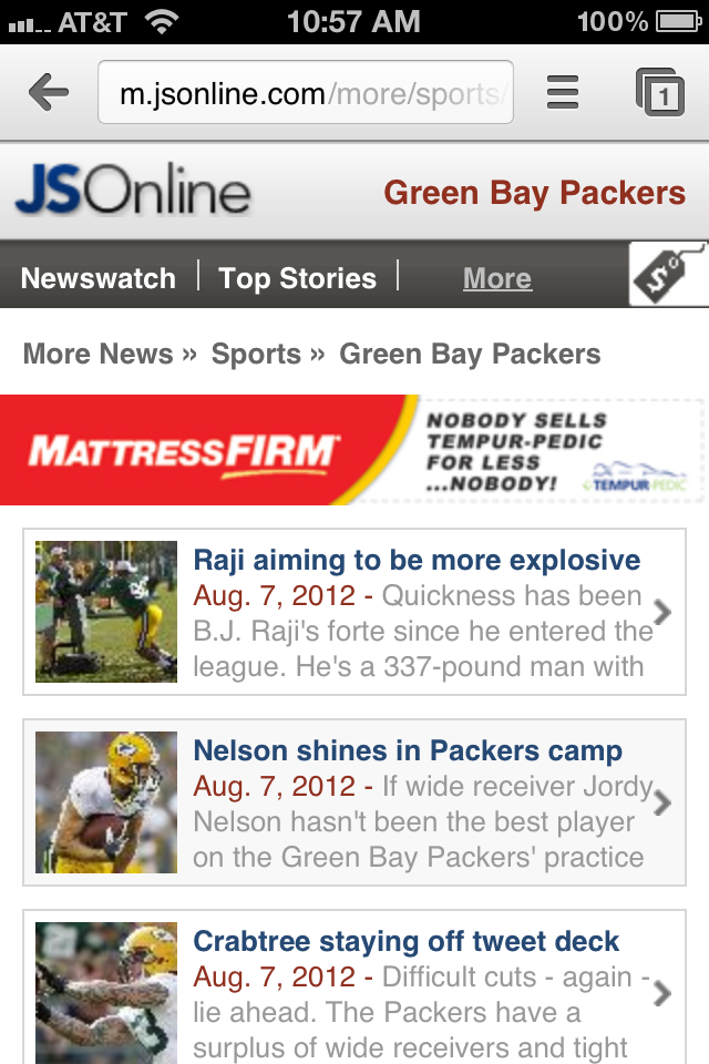
I love how the Milwaukee Journal Sentinel has created easy to select items. On this page, which I visit almost every morning on my phone, the stories are easy to select with my finger. They are large enough for my pointer finger. The design is simple and easy to understand too. It’s a simple and great design for a new site.
2. Important Items at the Top
It’s incredibly difficult to design mobile websites because there is so little space. It’s actually easier for designers and website owners to load up a website page with tons of content. The tricky yet essential way to do it is to only include the highest priority items on a page. Even more important is including the top items at the top of each page.
Copyblogger

I love what the folks at Copyblogger has done with their website. They are focusing more on their services and software packages. These are their most important items and they put them at the top of every mobile (and every desktop) page.
3. Lifestyle Photography
There is a trend in mobile design where some websites are choosing to eliminate photography. I’m guessing this has something to do with the slow load time some people experience on their smartphones.
My advice is to go against this trend and use lifestyle photography. Your brand will really stand out amongst the crowd with photography. Just because people are looking at your website on their phone doesn’t mean they don’t want to see the products in action. In fact, people love looking at photos on their phones. Make it easy for your customers to scroll through photos and you’ll make them even more happier while also showing them more about the products you have to offer.
That leads to a well educated shopper and a happy purchaser. That’s more money in your pocket.
LL Bean

The folks at LL Bean have always been at the forefront of technology and that doesn’t change with their mobile website. Right at the top of their homepage is a great photograph showing their products in action. It’s great and it really stands out amongst other mobile websites.
4. Easy Access Search
People still use search the most on websites especially ecommerce websites. Navigation advances have been good, but people still prefer to use those search bars to find the item they’re most interested in on your website.
Make sure the search function if easy to access on your mobile website. If you know your customers are using internal site search (check your analytics) then having accessibile search on your mobile website is a high priority.
Eddie Bauer

The folks at Eddie Bauer have a simple mobile website design. It seems they realize that customers use search about 50-75% of the time when they’re visiting ecommerce sites. The search bar is right at the top and easy to use. Let the customers get busy finding what they’re interested in finding. Don’t make it difficult for them.
5. Use One Site Design
It’s kind of a pain to maintain different versions of the same website. It’s hard for you and your team, but it’s also confusing for your site users. I can’t tell you how many times I’ve immediately scrolled to the bottom of the page on a mobile website to click the “View Full Website” link. It’s just easier to find what I’m looking for and it makes my visit more enjoyable.
Companies that use responsive design know what they’re doing in the online world. Responsive design takes a little more design and development up front, but the long-term impact is huge for you and for your site users.
Responsive design allows you to manage one website while allowing your users to get used to a single site. No longer will they need to use that full website link at the bottom of your mobile site. Everything they need will already be there and even more importantly they’ll know how to find it.
The Boston Globe

The Boston Globe is one of the first major websites to use responsive design. It’s a great overall site design. The lines are simple and elegant. The focus is on the content and most importantly there is a single site for users to learn.
Is there anything we discussed that you disagree with?
Share your thoughts in the comments.