

Okay, hopefully you’re still reading.
I know that when it comes to the idea of great design that Craigslist probably doesn’t come to the top of your mind.
But Craigslist is very interesting to me. It’s been around for many years. A lot of people are comfortable using it.
There is something to be said for an organization that can design something that is easy for many, many people to use.
Wikipedia would be another example. Even a site like Reddit.
Being pretty is nice, but being pretty might take focus away from making something functional.
It’s probably safe to say that the folks at Craigslist aren’t focused on “pretty”. That leaves them open to think about function.
Here are some design lessons from Craigslist.
And the good news is you can still use these to make something that’s pretty and functional.
1. A Link Looks Like A Link
There is something to be said for those old school blue links.
For those of us that have grown up with the Internet (the last 15-20 years) we know what those blue links are. There is no question.
But in recent years it’s become a bit more difficult to know what a link is on a website or in an app.
Sometimes the link is a different color. Many times it’s not underlined. And since a lot of sites are different it’s difficult to know what a link is on a site or what is clickable.
I’m not saying you have to use blue links. But it’s good to make sure the average user can tell instantly what is a link.
2. Proper Heading Structure
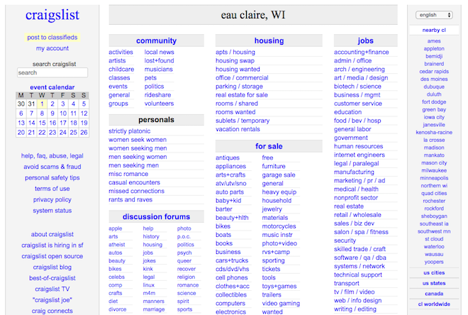
Again, it’s simple on Craigslist. The headings are structured properly.
The biggest text items (and biggest items in general) on the homepage are the Craigslist link and the location name.
That makes sense in the hierarchy.
Next up are the categories: housing, jobs, etc.
Then come the subcategories: antiques, appliances, etc.
If you visit a lot of websites and apps the headings will be all different sizes. The most important item won’t have the largest heading.
It’s often overlooked and it can lead to big time confusion.
3. No Distraction or Confusing Calls To Action
When you click on an item on Craigslist you know how to contact the person. There is pretty much one main call to action and that’s the simple gray/white “reply” button at the top left on the desktop website.
This takes discipline. The tendency is to make sure that visitors have all the calls to action that they may possibly need or want.
But Craigslist knows what customers do most. They reply. The rest of the possible calls to action are easily found (usually in the footer or header), but they don’t distract from the most important call to action on each page.
4. Resource Info Easy To Find
A secondary call to action would be a resource. And Craigslist puts those in common areas where people look for them.
The sidebar and the footer.
You can easily find the help section, the about section and other sections in the footer. And there are others in the sidebar.
Most times when you’re using the site you won’t need these. But sometimes you might. That’s why these belong in the footer.
5. Easy Sorting
When you bring up a category or search for something on Craigslist it’s very simple to sort.
Most people probably just leave the feed of results sorted by newest.
But it is possible to sort by highest or lowest prices.
Are there other possible ways to sort that might be nice occasionally? Probably. I’m sure Craigslist has thought about it.
But the more you add the more confusing it will probably be.
Keep things simple. It doesn’t just have to mean simple sorting.
6. Simple Preview
Also in those feeds pretty much all you see is:
- Image
- Title
- Price
- Location
That makes it really simple. A lot of ecommerce sites try to give a lot of information on the preview page or results page or some type of feed.
Just remember that the more you add the more complicated it becomes.
Craigslist is one of the largest ecommerce sites in the world and they keep things simple.
So do the other large ecommerce sites.
7. Mobile Friendly
Finally, Craigslist has been around since well before the smartphone. But they have moved easily into the smartphone world.
They have an app, but their site is also easy to use.
The lesson? The simpler your website the easier it is to turn it into a positive smartphone experience or whatever experience there might be in the future.
Conclusion
Craigslist isn’t a pretty site in the traditional sense. But I think it has simple beauty. Very functional beauty. There are big lessons to learn from that. It’s easy, both as a businessperson and designer, to think too much about looks and not as much about function.
Both are great! But these are just a few things to consider on your next business design project.


