


Last week we examined current trends in the Travel Industry.
The post seemed to be a hit with readers so this week we’re going to look at another industry.
This time we’re looking at trends in the Outdoor Industry. The outdoors is something close to my heart. I’ve been born and raised in rural Wisconsin. It’s a great place to get close to nature. There are plenty of lakes and rivers. You can find a good chunk of farm land mixed with hardwoods of oaks, maples and birch trees. It’s a great state to experience the outdoors.
Almost two years ago I looked at the best hunting websites. Some of these sites are still favorites of mine. I think the best of the companies on that list take an approach that puts design as one of the main focuses at the brand. They know that design is essential to get customers to respond. Over time, these companies are always improving on their designs and looking for ways to build on their success.
This approach to design is something any company would be wise to follow.
While that post was similar to this post I think it’s time for an update and we’re going to focus more on outdoor websites this time instead of just hunting sites.
Let’s get into it.
We’re going to look at five trends.
Here is what you’ll read:
- Customer Experiences
- Photography
- Subtle Colors
- Video
- Call to Action Coloring
1. Focus on Customer Experiences
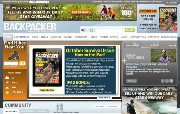
Any business or organization that has been around for a while realizes that they need to write about what their customers care about. Some of the sites on here like Backpacker are magazines, but since every company and organization is now a publishing company that’s alright.
Backpacker is focused on helping their customers. They provide instant access to outdoor locations. The make things local for people visiting. They want people to view their publication as a source for helpful information. This breeds loyal customers and customers that refer the source to friends.
For your outdoor website be sure to focus on what is really best for the customer. Target in on the two, three, maybe four things you target customer wants and provide those things. Don’t try to do too much. Focus on a couple things and be really good at them.
2. Photography
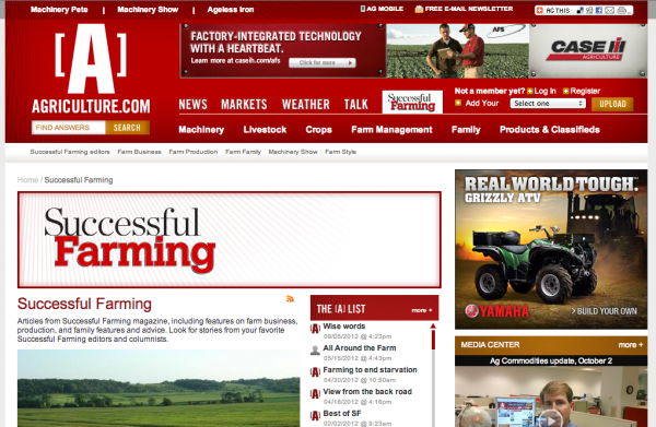
Photography continues to be a huge trend in a variety of industries. It makes sense for outdoor websites like Successful Farming (part of Agriculture.com) to use photos. This particular site has slideshows of old tractors and different farms. People are visual and your website can tell a story with photography.
More than words, photography allows people to connect with a brand. The outdoors industry really requires photography for websites. There is no way to avoid it and still have a great site. I would say that Successful Farming could be more focused on its photography, but I’m sure they don’t want to take away too much from the advertisements.
3. Great Use of Subtle Colors
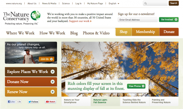
This trend is not common, but you can see with a site like Nature.org that a great color scheme really sells the site and its content. This is an amazing design for a website. It’s easy to read the various headlines. The navigation is great. It’s easy to find something you’re looking for and I really like the e-newsletter sign up at the top right. It’s all about building those subscriber lists. That’s where your money comes from.
The Nature Conservancy does a great job with photography. This element was evident on multiple sites.
I’m a big fan of white and light colors on websites so that’s probably why I chose this one for an example. I just think the subtle colors let in the background let the content speak for itself and that’s what you’re selling – your content. This will get people interested in your organization.
4. Videos
Video is everywhere. People are getting faster Internet connections and as a result people are watching more video. Businesses and organizations are paying attention to the demand for video and are creating it at a fast pace.
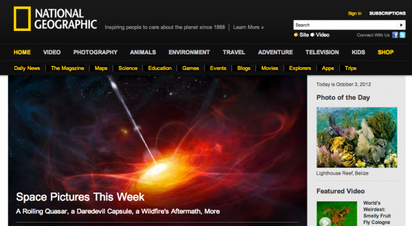
National Geographic has a unique brand feel that includes the classic yellow and black scheme. This site always has amazing photography just as they have always had in their printed magazine.
What you’ll notice on the site, though, is the video. The videos are stunning. It’s a natural progression for a media company that brings amazing images and stories from all over the world to its readers. Most of these stories have always involved the outdoors so it made sense to feature the site here.
5. Call to Action Coloring
This is an important one and you’ll notice that not all of the examples here follow it.
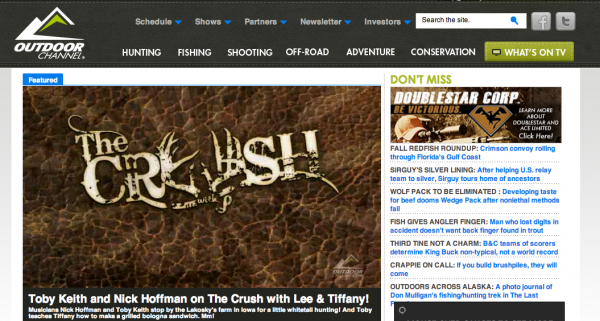
The color of your call to action elements needs to be consistent. When you look at the Outdoor Channel website there is no doubt that when you see something blue it’s something you should click.
As you create your site make sure there is one consistent color for all links and buttons if possible. People will get used to this and they’ll be more likely to take action when you want if they realize instantly that the button or link is an action item.
One of the biggest ways to confuse your site visitors is by using multiple colors for links. It will drive people nuts even if they don’t realize it.
There are some of the trends in the outdoor website industry.
What else are you seeing that is interesting in the website design world?


