
The power of color
Orange could be your favorite color, but it doesn’t necessarily mean it’s your customer’s favorite. So how do you go about deciding on a color palette for a website or new business’ branding strategy?
Colors have different driving forces, certain cultural meanings that should be taken into consideration before just choosing your favorites. Below is a guide to color meanings.
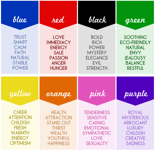
Color & Branding
Having consistent color usage throughout all your marketing materials is essential in creating a brand that people will remember. If Target started using blue instead of red, their customers wouldn’t recognize their messaging as Target, the brand they know and love. Setting up a color palette and style guide that can be used specifically for your brand is a great way to ensure consistency. Make sure you deliver that guide to all vendors that may be developing creative assets for you.
Hue
A color such as: green, red, blue, purple, etc.
Saturation
The level of white present in a particular color. A pastel color palette would be considered lightly saturated. Whereas a bold color palette would be highly saturated.

Value
The lightness or darkness of a color. The value of the color can change the meaning dramatically. For instance, dark yellow can look dirty and dingy, whereas bright yellow has the opposite effect.

Typography
There are two main categories of fonts — if they had to be put into two groups. Each type (no pun intended ) has its best uses. Other font groups might be: Hand drawn, comic, script, retro, typewriter, western, grunge, and many more. Let’s take a look at the two main groups, sans serif and serif.
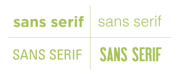
Sans serif type
Type without (“sans”) any fancy tails or squiggles on the ends of each of the characters. Best used for large amounts of text for its ease of readability. Below is an example of four different sans serif fonts.
There are thousands of different sans serif fonts. Yet, even the slightest alteration in style can give your website a totally different look.
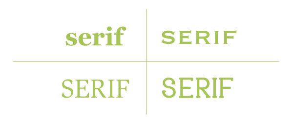
Serif type
Type with extended characters. They come in a variety of styles from bracketed and rounded to slender and sharp. The slightest change in serif type can make a dramatic difference to a set of type. Serif fonts are best for page titles or very short sections of text. Below is an example of four different serif fonts.
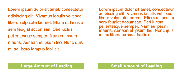
Leading (commonly known as line spacing)
Leading is the distance between two lines of type. For larger blocks of text, increasing the line spacing can help make your content more readable. Also, try increasing the leading between paragraphs to break-up large blocks of text. Below is an example of how leading can affect a body of type.
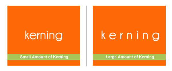
Kerning (commonly known as letter spacing)
Rule of thumb = the more space between letters, the easier the word is to read (to a point of course!) There should be an equal amount of space between letters. When there isn’t it makes the text more difficult to read as well. Below is an example of how kerning can affect type.
Adjusting the letter spacing can completely change the look of your type as well. It’s another way for designers to make website’s unique to their owners.
Web safe fonts
There are a number of web-safe fonts available for you to use on your website. Web-safe means that the font is available on most users computers. PCs and Macs have different standard fonts available on their respective systems. This is why you should set three different attributes when declaring a font family in your website’s CSS. If the first font isn’t available, the browser moves on to the second font and so on.
There are many web-font services that allow you to purchase alternative web safe fonts. A fee is typically associated with these services. You may also purchase web font licenses and host the font files on your web server. Depending on the needs and license requirements, either option may be suitable for you.
Example of CSS: font-family: Arial, Helvetica, Sans Serif;
Sans-serif web safe fonts
- Arial
- Comic Sans
- Impact
- Verdana
- Trebuchet MS
- Tahoma
- Lucida Sans Unicode
Serif web safe fonts
- Times New Roman
- Georgia
- Palatino Linotype
@font-face
So what about the thousands of other fonts? Good question! Browsers now support the use of the selector @font-face. This allows you to host fonts directly on your server and then reference that font in your CSS font-family declaration. No matter which browser your customer is using, the font will look as you intended it to (give or take a few pixels in certain browsers [smile] )
Below is an example of what that might look like in your CSS:
font-family: “ArvoRegular”;
src: url(“fonts/Arvo-Regular-webfont.eot”);
src: url(“fonts/Arvo-Regular-webfont.eot?iefix”)
format(‘eot’), url(“fonts/Arvo-Regular-webfont.woff”)
format(‘woff’), url(“fonts/Arvo-Regular-webfont.ttf”)
format(‘truetype’), url(“fonts/Arvo-Regular-webfont.svg#webfontau9vOdrl”)
format(‘svg’); font-weight: normal;
font-style: normal;
}
As you can see it’s still a little messy, due to the different ways the browsers handle web fonts. Each font style (IE. Bold, Italic, etc.) needs to be declared as well as hosted on your web server, adding to the size of your CSS file.
Currently, W3C (an international web standards organization) is working towards standardizing the WOFF web font format. Currently Firefox and Chrome support this format, due to its small file size and the ability to add a license to it.
further @font-face resources around the web
The @font-face rule and useful web font tricks
@font-face
@font-face Font Kits
White space
Alas, the infamous term white space. You might have heard this term thrown around loosely once or twice. For a defintion, check out Chapter 4 Terminology. Depending on your industry and site goals, white space guidelines can vary drastically. Adding space around important elements can allow them to stand out on the page. It also makes text more readable because the eye has less to take in at once. The more you cram into a small area, the harder it will be for your user to process each individual piece.
Real estate on a web page is extremely important, especially for e-commerce sites. There needs to be a fine balance between using white space and pushing important content too far down the page. Your designer can provide you with their recommendations based on your particular needs.
Screen resolution
An important factor to consider when creating a website design is the screen resolution you should be targeting. Today, the standard screen size is higher than 1024 x 768. But many users with larger screens don’t maximize their browser window to fill the entire screen. I recommend you take a look at W3school’s screen resolution trend chart to see the current sizes. Your web designer should be able to give you recommendations as well. Consider your target market and what screen size they may be using.
A good way to find out demographics if you are starting a new business is to use a online tool called Quantcast. Simply type in a web address similar to your business and take a look at their site’s demographics. This will give you a close idea of what your typical buyers might be like.
The fold
When working on a website design, one item to take into account is the fold, or where the bottom of the browser window is. Many users install toolbars on their browsers and don’t maximize the browser window as mentioned previously. Therefore the fold could fall only 500 pixels down your web page, rather than the standard 768 pixel mark. The web has been around quite sometime now and many older customers are beginning to use the Internet more frequently. Most users do know how to scroll down a page without any issues. But, that doesn’t mean you should bury important elements too far below the fold.
Below is an example of where a “fold” would be located in orange. The important information is all above the fold for ease of usability (circled).
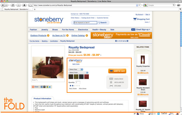
Online retailers often struggle with the fold phenomenon and their call to actions, such as the add to cart button. Your customer shouldn’t have to scroll very far to be able to perform a crucial action such as adding an item to their shopping cart. Often times there is a logical flow to product page. You choose the size, color and quantity attributes and then click an add to cart button. Even if the button happens to fall below the fold, the user would still need to select all preceding options before performing that final action.
All that said, it’s an important factor to consider but if the process and flow of the page makes sense while scrolling, the fold of the browser window isn’t going to affect conversion as much as one might think it will.
Optimization for speed

Your designer, visually, may have the best collection of work you’ve ever seen! They’ve even come highly recommended by other businesses in your area. But their sites load extremely slow. Or maybe you don’t recognize their speed issues because you’re using a high speed Internet connection. Too bad your target market is still using dial-up or a basic cable connection.
Speed can cause your customers to leave your site within 4 seconds. Don’t make them wait.
You wouldn’t want them to wait in your physical store, why not consider their patience level online too?
3 quick tips to decreasing load times
- optimize all images throughout your website. Save all images at the exact size they appear on the website at 72 dpi. If you can create the graphic in CSS rather than using an image, do it. Don’t cut corners and slow down your website when you don’t need to.
- Limit your use of Flash. If you don’t have another option, make sure the movie is fully optimized and tested. Make sure you have a loading bar to show the user something is happening so they don’t decide to leave before it’s done loading.
- Use external CSS files and avoid inline CSS when possible. When you include CSS directly in an HTML file, the browser has to load additional code every time a page loads. A browser is setup to cache reusable items such as CSS and JavaScript code. When a browser caches a file, it refers to it locally, rather than downloading the file from the server each time a new page loads.
YSlow is a great add-on for Firefox to determine how well your site’s performance is. It grades your site on content, CSS, HTTP requests, images, and more.
Illustration & photography
Illustrations & photos can really bring a sense of personality to your website. But, not all styles or shots are ideal for every business. When working on a website team, it’s important to always think about your target market and what they would want to see, rather than what your personal preference is.
Start Reading Chapter 6: Giving Feedback