Mobile Menu Button Usability
Do people know what the hamburger icon means? Is it killing your mobile conversions? In an A/B test, done by Exis Web, results show that users may not know what the three-lined hamburger icon actually means.
This brings up a whole other conversation about how we go about introducing new icons and symbols on the web, without hurting usability. Perhaps utilizing both Menu and the hamburger icon is a good approach to help push these new symbols into the mainstream market slowly. The world may not be ready for hamburgers alone. At least not yet.
How does your responsive website stack up? Perhaps a burger shouldn’t be on your menu 😊
Mobile Maps: Make it Easy for Users to Scroll Past or Hide
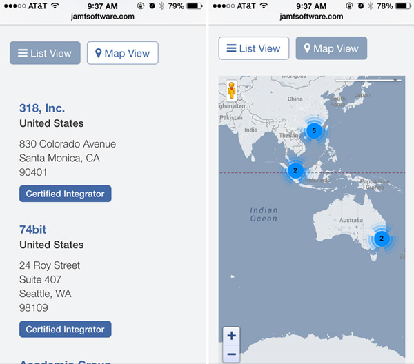
With little available horizontal space, scrolling past a map on a smartphone can be challenging, if not given enough space on either side of a map. Studies done by the Nielsen Norman Group suggest that users prefer a list view over a map view when it comes to browsing search results. They are easier to scroll through and take less bandwidth to navigate vs a map.
Providing a “Hide Map” link before your map can help improve usability if you are proving a map and list view together on a single page. Or have the map closed at default so users can choose it if they need it.
Forcing Users to Login, Before Showing Them Any Content
This particular item goes for both mobile and desktop users. Nothing is worse than making your visitor work before they get anything in return. Sites like Ruelala and other specialty e-commerce businesses offer special sales and deals, but only if you register first. They don’t even let you see what you could be getting without creating an account. I don’t know about you, but that is a major turn off. With so many different avenues to shop on, why would I work harder for one business when I can find something similar without doing any work?
Retailers are also guilty of this big usability issue in checkout. Offering the option to checkout as a guest first is much easier to digest than again, having to fill-out account information before receiving anything in return. Guests want to have a good experience checking out, before they’ll consider creating a permanent account and signing up for your e-newsletter.
View the study by Nielsen Norman Group
Crossing The Fold

Does your content cross the fold of your users choice mobile devices? The fold is the place where your screen’s content ends and you have to scroll to see additional content. Placing content across this divide is important because it gives your user an indication that there is more content below their current field of view.
Give your visitors a reason to keep scrolling. Tweet This
For more mobile usability tips read more from this article from @smashingmag
Avoid Small Links Along Edges
Lately I have personally been aggravated by this simple usability fail. Placing clickable items such as small text links next to the edges of the screen can make them impossible to click. The sensors, in my case on an iPhone, tend to be less accurate near the edges of the screen. If part of your thumb hangs over the edge, it registers the touch as if you were grabbing the edge of your phone, rather than the screen itself. My fingers aren’t very large either. So that leads me to believe it’s even more difficult for larger thumbs and fingers to click.
If you have to place clickable items near the edge, make sure they are big enough (at least 50-60 pixels wide or tall) so your visitors can click them without frustration.