
An email campaign wasn’t meant to look like a website. Navigation exists on a website to allow you to navigate and easily find all the content within it.
An email campaign doesn’t have pages. It is a single piece of advertising usually with a primary purpose and a few secondary goals. So why do we take website principles and apply them to email if they don’t serve the same purpose?
Email Navigation for Retailers
Navigation bars tend to generate a high amount of click-throughs, especially in the world of retail. Paired with a big promotion or coupon code they offer quick access to shopper’s favorite categories.
In the below example, REI uses a simplified version of their full website navigation in their email campaign.
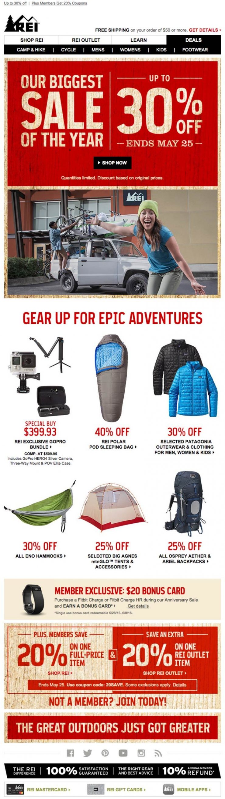
REI Email Campaign with Navigation
When paired with a promotion, including popular links from your website is an excellent way to provide enough variety to peek the interest of a shopper by giving them a reason to click-through.
If your goal is more specific like this next example from BarkBox, leaving out a navigation bar is key.
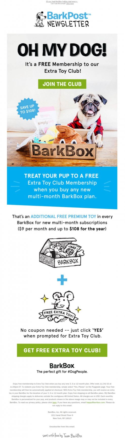
BarkBox | No Email Navigation
One Primary Goal
BarkBox has one goal–to increase club memberships. Including their full website navigation on their email would only serve as a distraction from reaching their goal.
Each email campaign can serve an entirely different purpose from the next. Deciding whether or not to include navigation should be done on a case by case basis.
There isn’t a one-size-fits-all rule to this often asked question.
Mobile Considerations
Another dilemma that arises when including a navigation bar in email is how to properly display it on mobile.
With limited space we must pair down the navigation considerably or make smart design choices when building out our email templates.
Here are a few examples of how some retailers have handled their navigation in a mobile context…
Limit Your Links
In the below example, REI drops a few of their primary navigation links in the mobile version of their email. The benefit to this method is the placement of the links are still in the same spot as they were on a desktop computer. Using familiar user interface principles is a smart way to tackle mobile email.
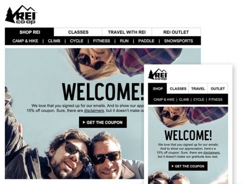
REI Mobile Email Navigation Example
Drop It Like It’s Hot
Another approach, used by Loft (below), is to drop your navigation links to the bottom of the email. The downside to this method is you’re changing the placement entirely so your user may not see them if they don’t scroll to view your entire email. On the plus side they are much easier to click with clumsy fingers and can bring more attention to your main graphic or promotion.
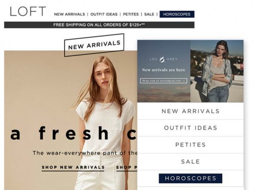
Loft Mobile Email Navigation Example
Mobile-First Approach
The least complex approach to mobile email navigation is to use the same approach on both your desktop and mobile versions.
Express (below) uses a mobile-first approach and does the same thing no matter what device their customer’s are viewing their email on.
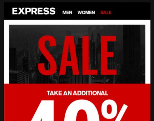
Express Mobile-First Email Navigation
Conclusion
Making the right decision on the hot topic of email navigation will allow you to reach your goals more effectively. Remember every campaign is not created equal. Understanding your end goal first will help make your decision easier.
Happy emailing!