


It’s pretty crazy to think that Amazon accounts for about a fourth of all online e-commerce sales. That is incredible. With dominance like that it’s no wonder marketers and designers have been trying to figure out what makes Amazon work so well. From a design point of view, Amazon has taken the approach of making a series of small changes over time. The company did recently roll out a pretty extensive change to their website, but even that was rolled out slowly to give users a chance to adapt. Most folks in the online industry want to analyze the basic design of Amazon to gain insight that could make their own business successful. I thought we could look at Amazon’s homepage today and try to pull out a few takeaways.
Analyzing Amazon’s Homepage
It’s impossible to know what really makes Amazon’s website successful. Outside of design the site is always up and responsive. The operational aspects also make Amazon successful along with having just about any product you could imagine. And they always seem to have it in stock. Those are big factors. Knowing all this let’s just look at their design and try to pull out some pointers to use on the next website design project.
Focus On a Profitable Product or Service
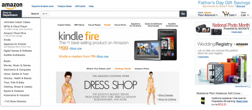
Something that has always confused me about Amazon’s homepage is the noise. The page is full of elements everywhere. There really isn’t much white space when you first look at the page. It’s full of junk. It’s not something the minimalist would design, but the common saying is that the design must be working because Amazon is the biggest online retailer in the world…by a wide margin. The first element that does capture my attention on the page, though, is the Kindle Fire call-out. This is obviously Amazon’s biggest product offering right now from the consumer side of things. The Kindle Fire itself is not profitable, but the content sold for the product is one of Amazon’s biggest profit generators. It’s for this reason that Amazon wants to put its own product front and center on the homepage. It’s homepage design 101, but remember to feature your most profitable item or service on the homepage. You want people to know what you are and what you sell right away when visiting your website.
Encourage Shopping & Exploration
Amazon was one of the first or perhaps the first to create the left hand navigation. They are still one of the only companies on the Web to use this style of navigation. Most companies seem to use the top navigation, but there are quite a few instances of companies using left areas for refinements. The latest iteration of the Amazon left navigation comes complete with fly-out. I’m not a huge fan of fly-outs these days, but it seems to work for Amazon. Their sidebar and top search bar encourage visitors to get beyond the homepage to start shopping. The homepage kind of acts as an introduction for the visitor. A new visitor can see the item of the day (the Kindle Fire), which is what Amazon wants. Some will click on that element, but most will need to move on to their shopping. Amazon encourages shopping by offering the left navigation and the search bar. It’s easy for people to start getting to the best results for their queries. It’s a simple experience, but one that works well. One last note on the left navigation is the focus on the most profitable products from Amazon’s standpoint. They put the downloads and other content at the top of the navigation. Amazon isn’t stupid. They want people to find what they’re looking for but they want to promote the most profitable products first.
Personalization Is The Future
Mass marketers have been trying to get to a 1-to-1 relationship with their customers forever. Amazon has been the leader in attempting to get personal with customers since the beginning. The personalization includes showing recently viewed items and suggested items and customers that also bought this item bought this item. It’s crazy how personalized Amazon can get and the company isn’t afraid to get really big brother with the way they show it to visitors. They put the suggestions on the homepage, in the footer on every page the visitor sees as well as including the personalized items in emails. The personalization has to be a key factor to Amazon’s success. They have been pushing it forever and the process seems to be getting better and better.
The Footer is for General Information
Way at the bottom of the page you’ll see a basic footer. Amazon seems to understand that the footer is where people go to find basic information. There isn’t much reason for a footer. You don’t want people being distracted by the secondary items that belong in the footer. However, for the few folks that come to your homepage with a purpose you want to have the basic information there for them to find easily. This is why most people put basic items like contact information and legal stuff in the footer. Amazon links to all its affiliates there and other items that some customers find useful. It’s not important for most folks, but it is easy to find for the few that need it.
The Biggest Lesson: Design Shouldn’t Get In The Way
It’s safe to say that the design of Amazon’s site is important, but it’s really not the main reason for their success. The success of Amazon is the result of many things. Their operations are efficient. The company offers some great products and probably every product anyone could ever want. The brand is also something people recognize. Heck, people might only think of five things when they think of the Internet and Amazon is probably one of them. The design shouldn’t get in the way of your business. That’s the main takeaway from the analysis of Amazon. If you try to get crazy with the design you’ll end up doing too much and the design will take away from the purpose of the site and the business. Don’t clutter your site. Focus on the main goal of the site and leave the rest out. It works for Amazon and they’re the biggest online retailer in the world.


