

Your typography affects how your business is perceived. It has the power to change the tone of your copy from sounding friendly and casual to professional.
Typography is one of the most important areas of design for any brand. It’s a small change that can make a big difference.
Why update your typefaces?
- To better communicate who you are
- To reach a new audience
- Improve your user’s reading experience
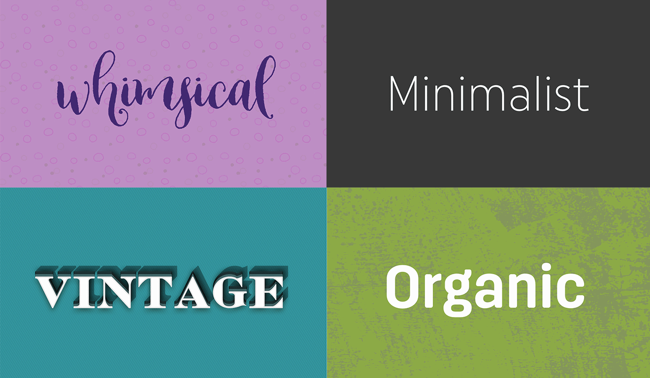
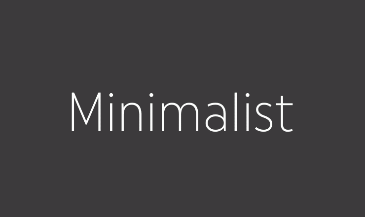
Examples of typefaces
What’s the difference between a typeface and a font?
A typeface is a family of fonts, whereas a font is a single style within that font family or typeface.
The style of typeface your brand uses is one of the ways your audience gets to know who you are. If you haven’t established what your brand values are, start there first.
Is your brand historic? Is the audience you are targeting young and whimsical at heart?
Or are you more of a serious, professional organization who values accuracy?
Your typeface should represent who you are as an organization, not necessarily what you sell.
Here are some examples:


Legible body font
Is the font you use for smaller body copy legible? Choosing a font that communicates your brand’s personality and one that is also legible will help improve the readability of your content.
If the font is too small or condensed any work your company has done to craft compelling content will be wasted.
Some great choices for small text include:
- Antartida Rounded
- Gibson
- Proxima Nova
- Helvetica
- Filson Soft
Legibility vs. readability
Your fonts may be legible, but are they readable?
Legibility: Being clear enough to read.
Readability: The ease at which a reader can understand written text.
The characteristics of a font that makes it readable include:
- How tightly the letters are kerned (the space between the letters)
- The line spacing (the space between lines of text)
- The width of a block of text
Examples of kerning
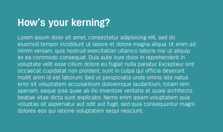
Properly kerned typography will allow your words to be more enjoyable to read.
Condensed kerning is more difficult to read and may turn away visitors.
Examples of line spacing
Proper line spacing will allow your text to be more readable.
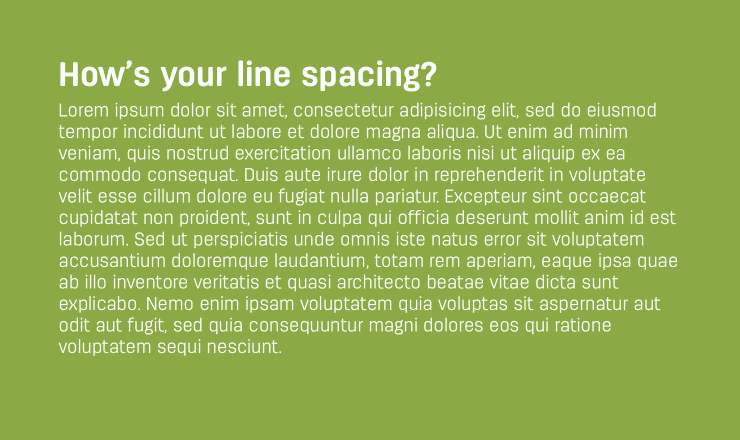
Tight line spacing is more difficult to read as your eyes become distracted with the line of copy below.
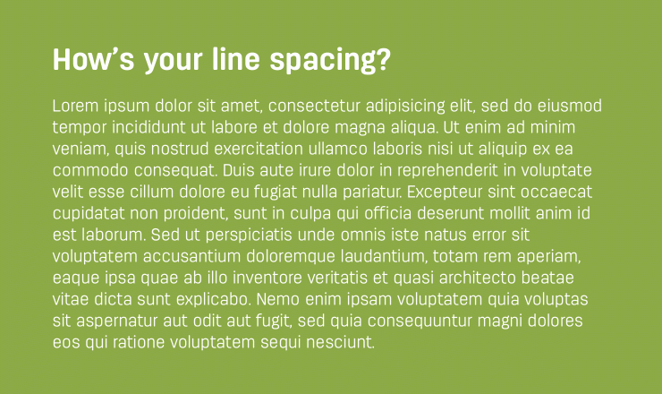
Looser line spacing is ideal for readability.
You can select the most legible font for your content but how it’s treated can make all the difference in how it’s consumed.
Title case vs. sentence case
Choosing between title and sentence case is a decision that is oftentimes overlooked or not clearly defined by businesses due to being difficult to enforce. It has a big impact on how your typography feels. It directly affects the tone of your content.
Title case: “The Rabbit Chased The Mouse”.
Sentence case: “The rabbit chased the mouse”.
Title case is more difficult to read, especially with longer lines of text. This is due to the eye having to jump over each capitalized word. This upward and downward motion causes more strain on the eyes.
Title case comes off more formal than casual.
Sentence case, on the other hand, is easier to read. It’s more friendly and approachable.
Curious how other companies decide? Take a look at Apple vs. Google when it comes to choosing letter case.
How many fonts is too many?
You might be able to take 10 different fonts and make them all work well together.
Just because you can, doesn’t mean you should.
I like to choose 2 or 3 different fonts for most design projects. One for headlines and larger copy, one for body copy, and occasionally a third to be used for quotes or more decorative use cases.
Some projects may lend themselves well to use 10 fonts. It’s important to understand that if the font needs to be used on the website as HTML and not embedded within a graphic, each style (bold, italic, regular) must be loaded with a font file. The more styles you load, the larger in file size each of your web pages become.
Every font isn’t created equal either. Some may have more special characters and features that increase the size of their files.
Speed is absolutely critical to a successful user experience online, among other benefits. So think twice before choosing to have more than 2 or 3 fonts on your website.
Choose fonts based on use cases
Before you decide on a typeface, determine where and how the font will be used.
- Do you need to italicize?
- Will you have blockquotes?
- Is there a reason to have multiple weights or is bold enough?
- Will you be using any special characters (ampersands, accented letters, measurement symbols)? Not all fonts are equipped with every character.
Look at the bigger picture before making the big decision to choose a new typeface for your marketing materials. Make sure it speaks to who you are as an organization, is easily readable and can be used in the many marketing channels you might be taking advantage of.
There are more decisions than meets the eye that are needed to develop stunning typography for your business.


