Top Website Design of the Week
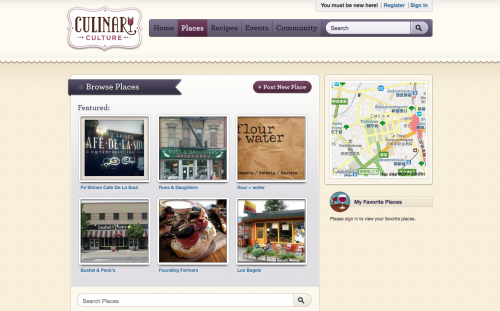
Culinary Culture
Why it Stands Out
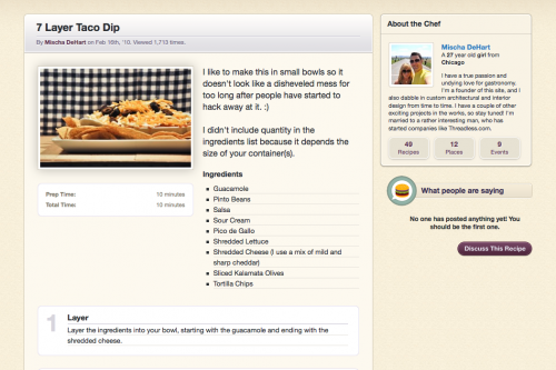
The layout of this website is brilliant. Using a consistent 2-column grid, each section of content is clearly defined making it much easier to find what you’re looking for. The typographic hierarchy of the site is great, allowing more important titles to take precedence in size. Subtle details, such as shadows and gradients & the outlining of background images and photographs really add to the design.
Top App Design of the Week
LetterMpress
Why it Stands Out
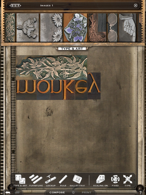
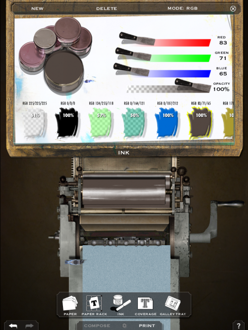
Letterpress gone digital! LetterMpress by John Bonadies is a fun, hands-on app that combines technology with old fashion printing. The interactions are smooth and very realistic. It’s as if you’re using a real letterpress. The organization is great and still stands true to realistic conventions. For example, your letters and woodblocks are stored in a drawer that slides out of the way while your laying out your design. If you love letterpress you’ll love this app!
Top Font of the Week
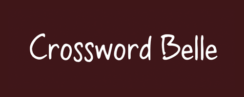
Crossword Belle
Why it Stands Out
Crossword Belle is a great casual, handwritten font. The variation in x-height of the “s” in the above example helps to give the font a playful, organic feel. It would be perfect for a youthful audience or for a kick-back & relax type of feel.


