Mobile-friendly, responsive, mobile devices–what does it all mean? The word mobile is no longer relevant.
When we use the term mobile, what exactly are we referring to? Is the user mobile? Is the device smaller than the size of a desktop computer? But what size?
Times have changed.
When mobile devices first hit the market, we were referring only to cellphones. In the web world you might hear your designer or developer talk about 320 or 480. Now days, a smartphone might have retina capabilities and the screen resolution is completely different than the person sitting next to you. You might be reading this article on an iPad or a Kindle Fire.
The term mobile implies movement, or the ability to be moved easily. So yes, mobile devices works, but we need to take the time to be more specific when we are discussing specific devices.
We can’t make such broad assumptions about what mobile means anymore. Its become much more complex than that.
Making Assumptions About Mobile Users
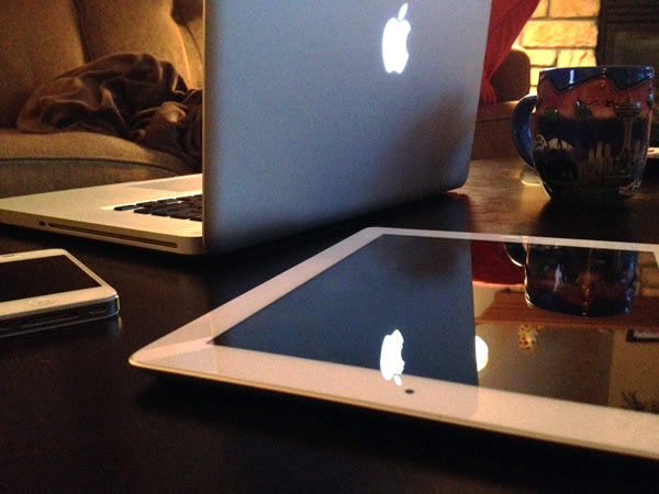
Maybe people assume that tablet, smartphone and other portable devices’ users are on-the-go. This is originally where the term mobile came from. The truth is, many people who own these types of devices might be sitting at home on the couch, too lazy to grab their laptop or to start-up their desktop computer. Yeah, I fall under that category quite often.
This might have been a more accurate statement 4 years ago.
Today with so many different types of portable web devices, we have the luxury & convenience to use them anywhere we please. Sometimes we are on-the-go, sometimes stationary with full concentration on what we are doing with the device.
Responsive Design for Mobile Devices
Responsive design has changed the way we look at mobile devices. In a way, it has guided us to the realization that we can’t single out mobile devices as being used for very specific purposes. Often times users want to be able to find the same content that is available on the desktop version of your website. When they can’t chances are they’ll leave and on top of that, become frustrated.
Responsive design forces designers and business owners to really think about the content they are putting out there. If you would consider ditching it to save bandwidth and clean up your iPhone sized version of your website, then likely it doesn’t have any business being on your website in any context.
Small screens force us to reconsider content. Users on mobile devices of any kind want all the content you have to offer too.
Lesson: Don’t discriminate against your portable device web users.